Note: If the data here is old, try to refresh the page using ctrl-F5 on Windows and cmd-alt-r on macOS, and/or clear your browser’s cache.
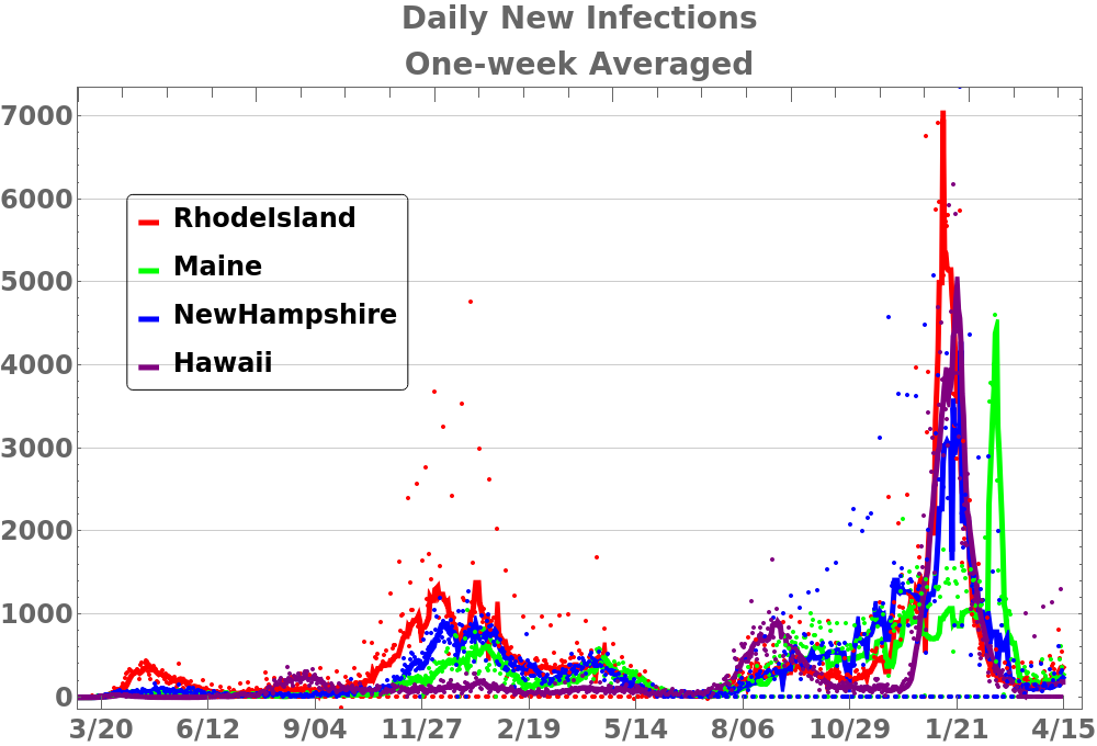
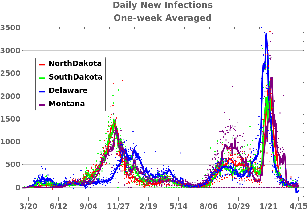
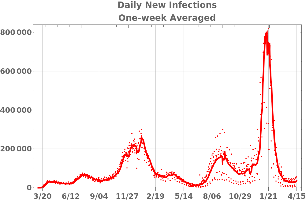
This first set of plots shows the number of newly infected people infected averaged over a one-week period. Each plot shows four states in order of population. The scale is not the same on each plot and since these are not normalized by population the totals for some states are difficult to discern. Obviously it’s hard to discern how much of the changes are from additional testing. This data only counts people that have actually tested positive for the virus and not people that have only subsequently tested positive for antibodies.
Dots show daily data.
States sorted by population
Click to enlarge.