Click the above VISUALIZING COVID-19 menu item for more pages.
I have generated graphs for each state (divided into counties) and the United States (divided into states and/or counties) showing:
- Overview
- Plots
- Running Totals
- Daily Changes
- Day-to-day Ratios
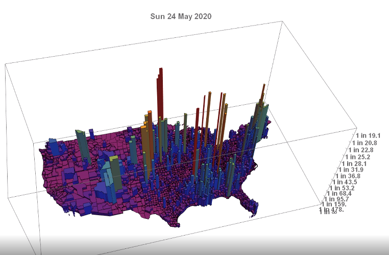
- Animations
Disclaimer: All of these graphics rely on data from The New York Times, published in their GitHub repository. Please visit there and especially read the section on Methodology and Definitions. I think it is a very honest account of the shortcomings of the data that everyone, from the CDC to Johns Hopkins University to The New York Times, is compiling.
You must be logged in to post a comment.