Note: If the data here is old, try to refresh the page using ctrl-F5 on Windows and cmd-alt-r on macOS, and/or clear your browser’s cache.
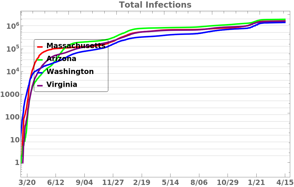
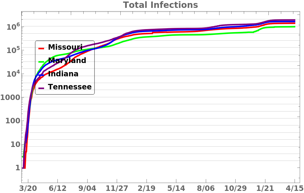
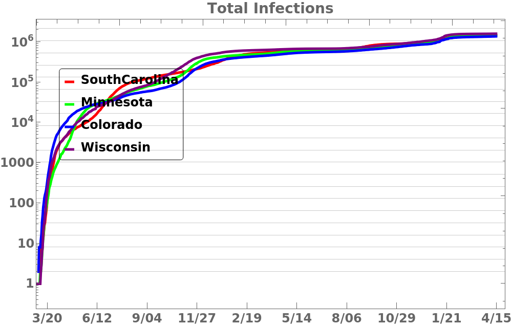
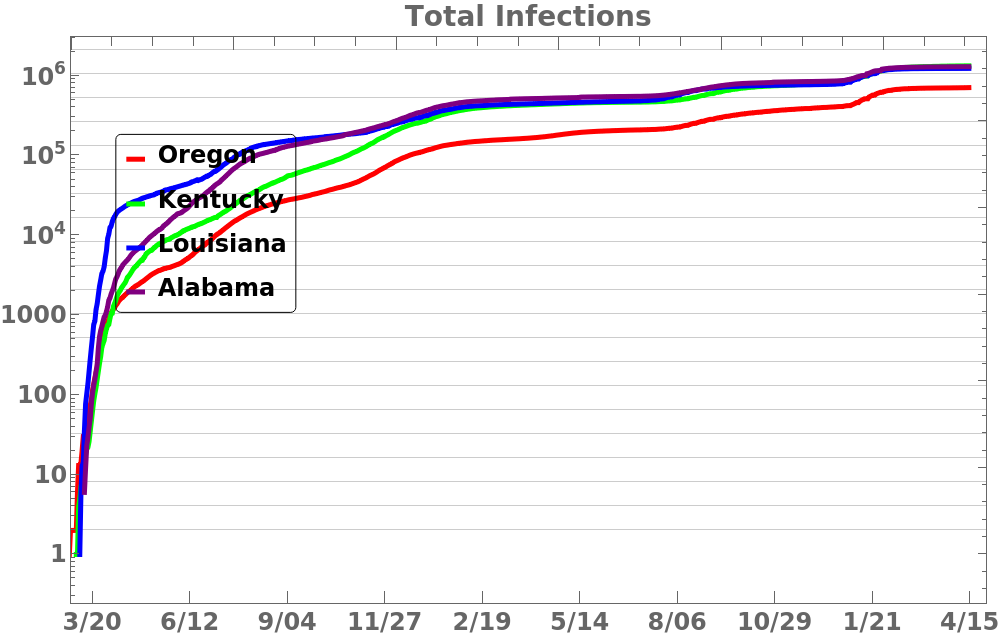
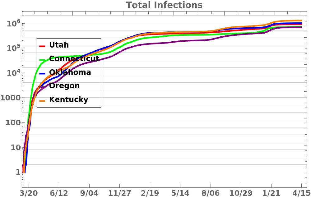
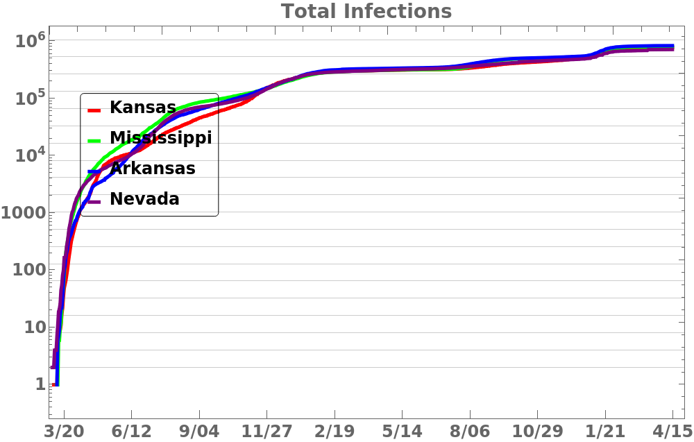
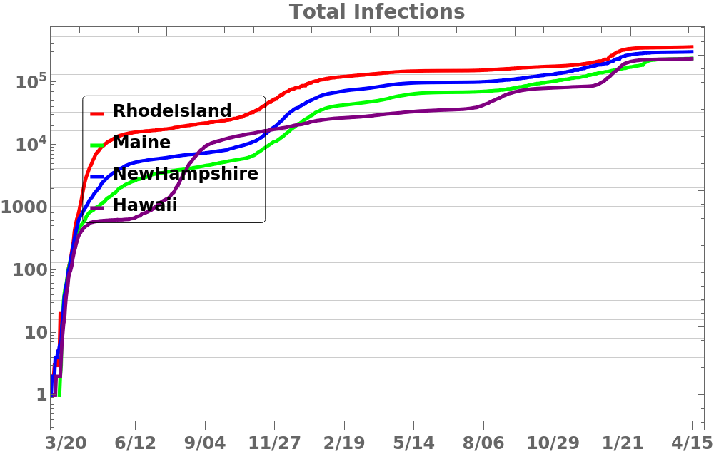
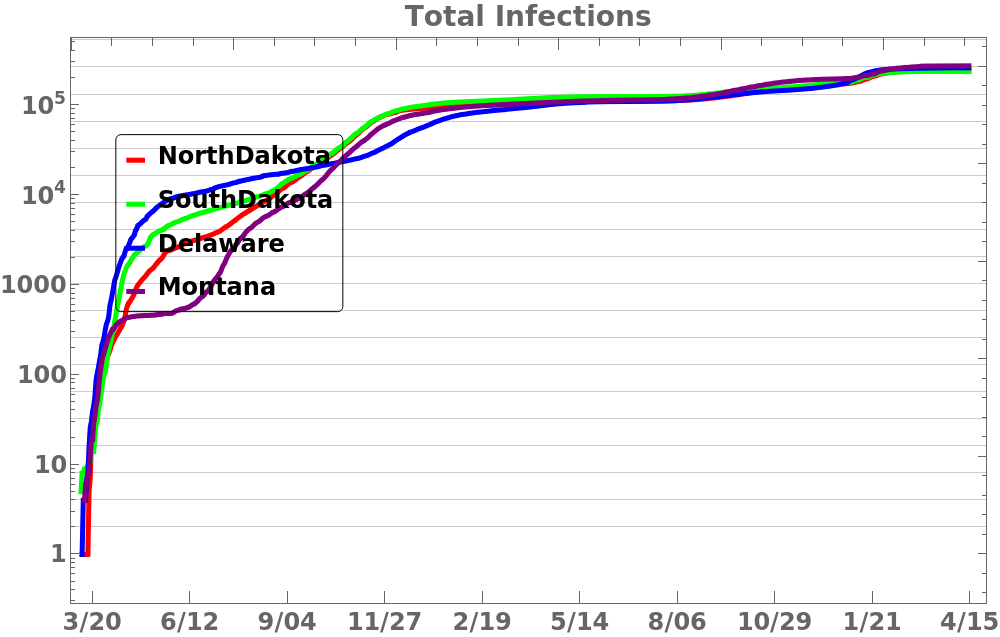
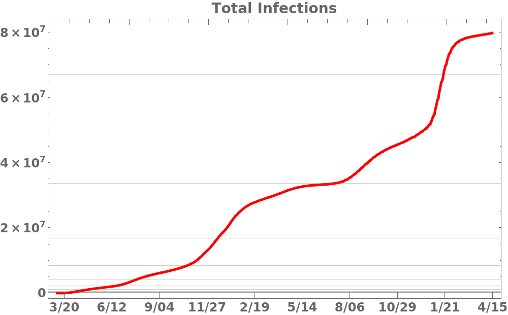
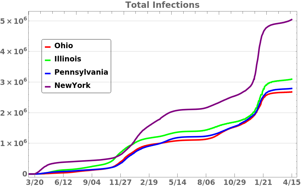
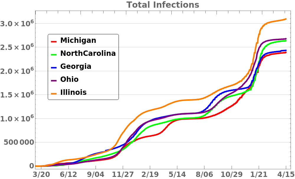
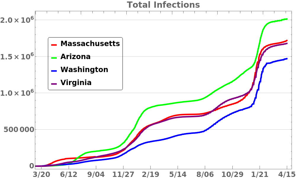
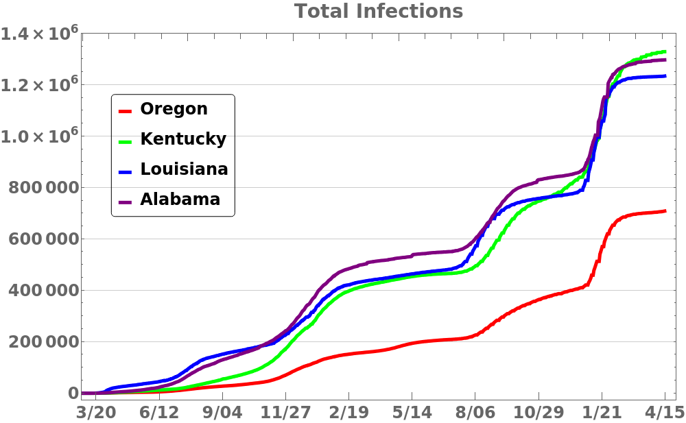
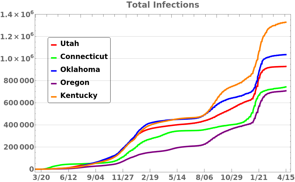
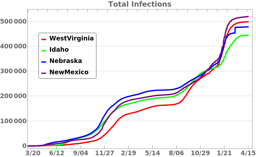
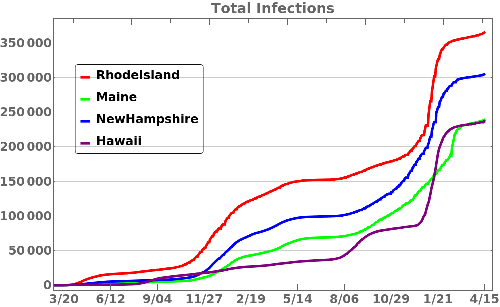
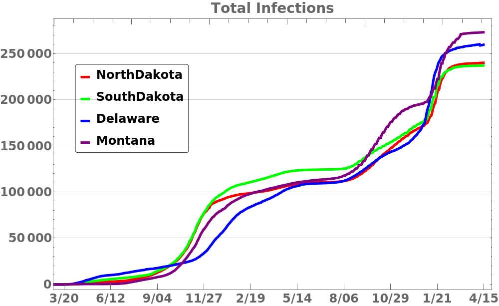
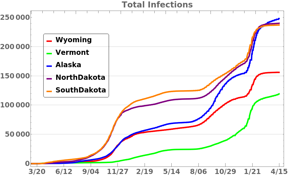
This first set of plots shows the running total of the number of people infected. Each plot shows four states in order of size. The scale is not the same on each plot and since these are not normalized by population the totals for some states are difficult to discern. One can see the rate of infection spread is slowing as the time it took to go from 1 million to 2 million cases is quite a bit longer than the time it took to go from 1/2 million to 1 million cases.
States sorted by population
Click to enlarge.


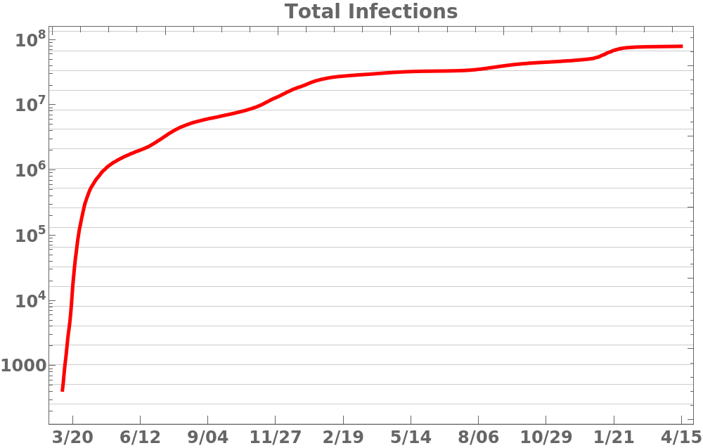
The following plots show the same information but using a logarithmic scale which better shows exponential growth. The slope of the curve is the factor 

States sorted by population
Click to enlarge.