Note: If the data here is old, try to refresh the page using ctrl-F5 on Windows and cmd-alt-r on macOS, and/or clear your browser’s cache.
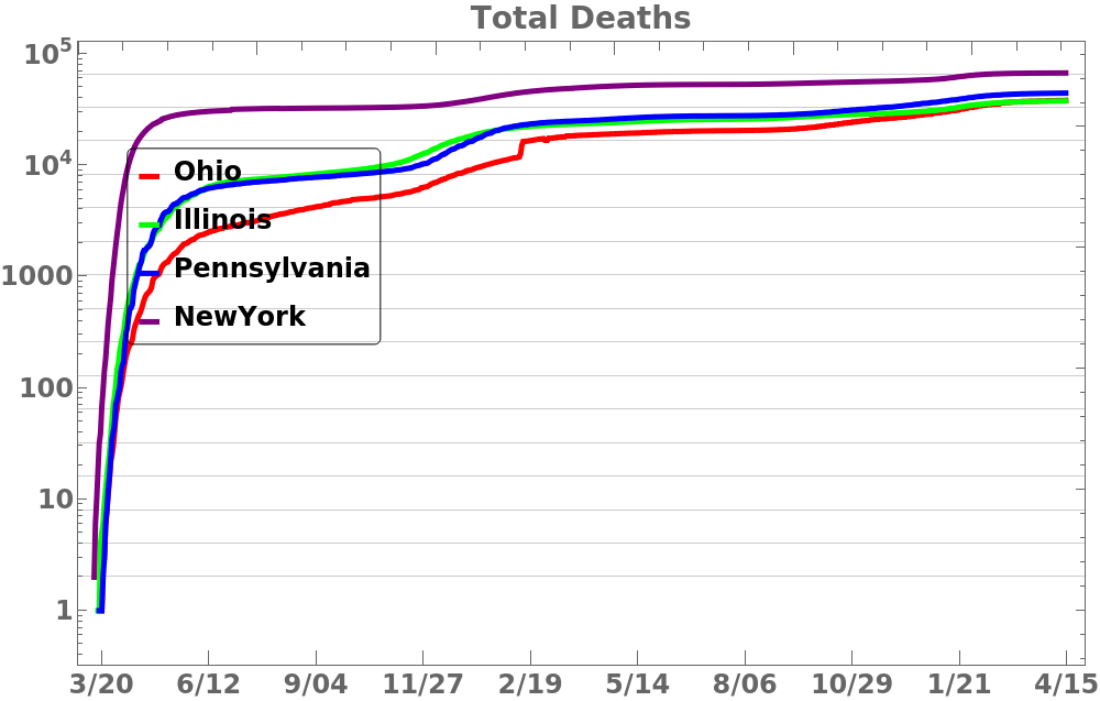
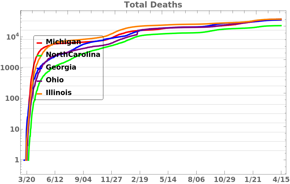
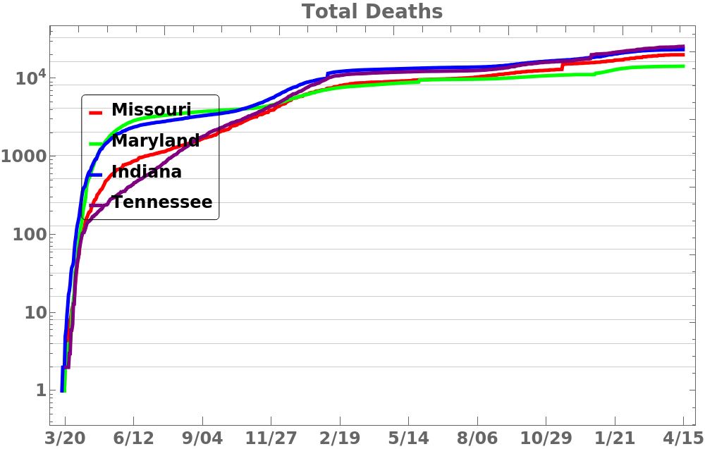
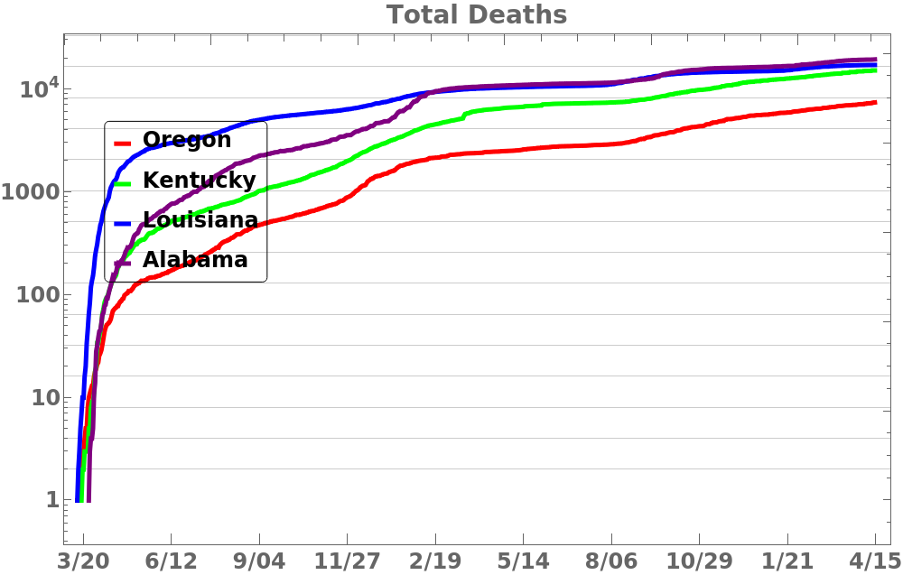
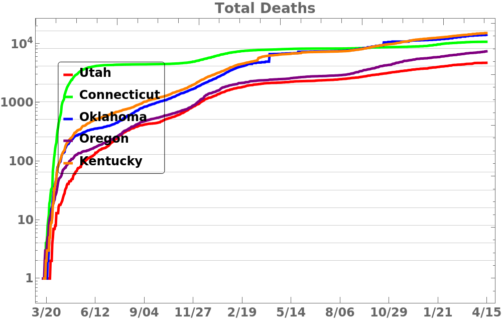
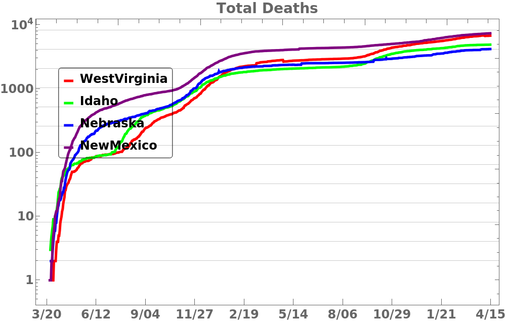
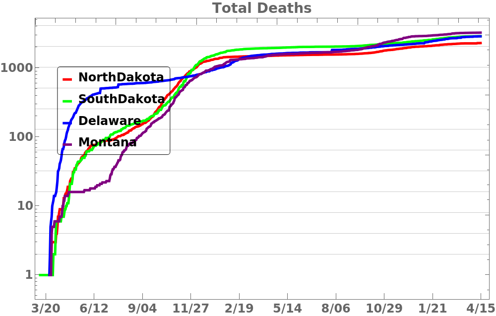
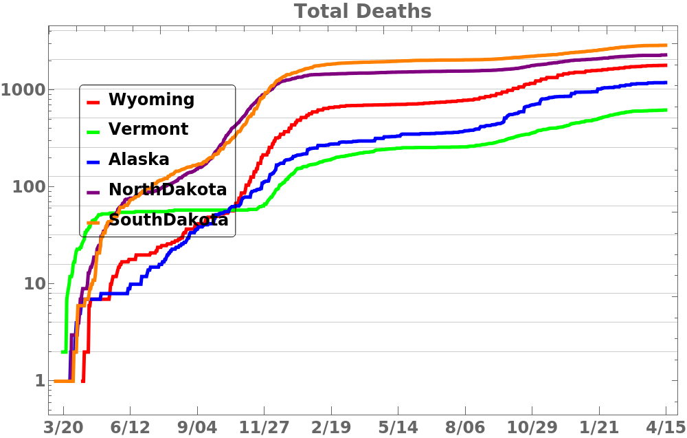
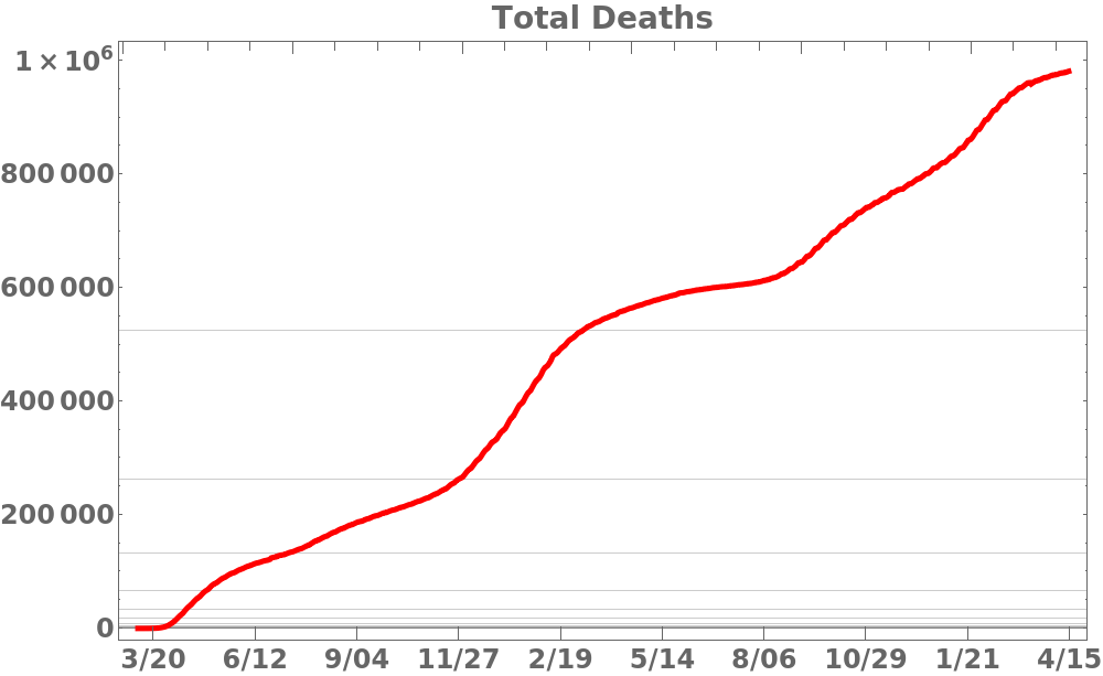
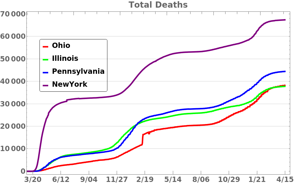
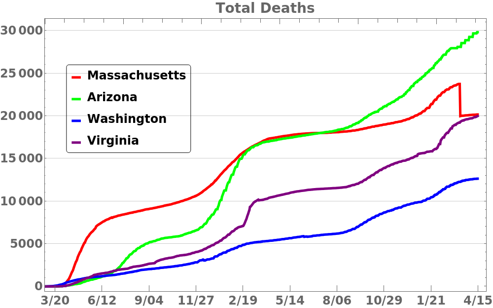
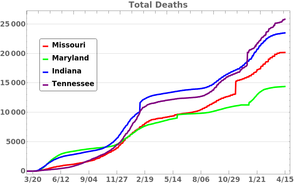
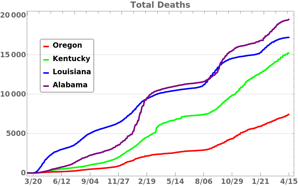
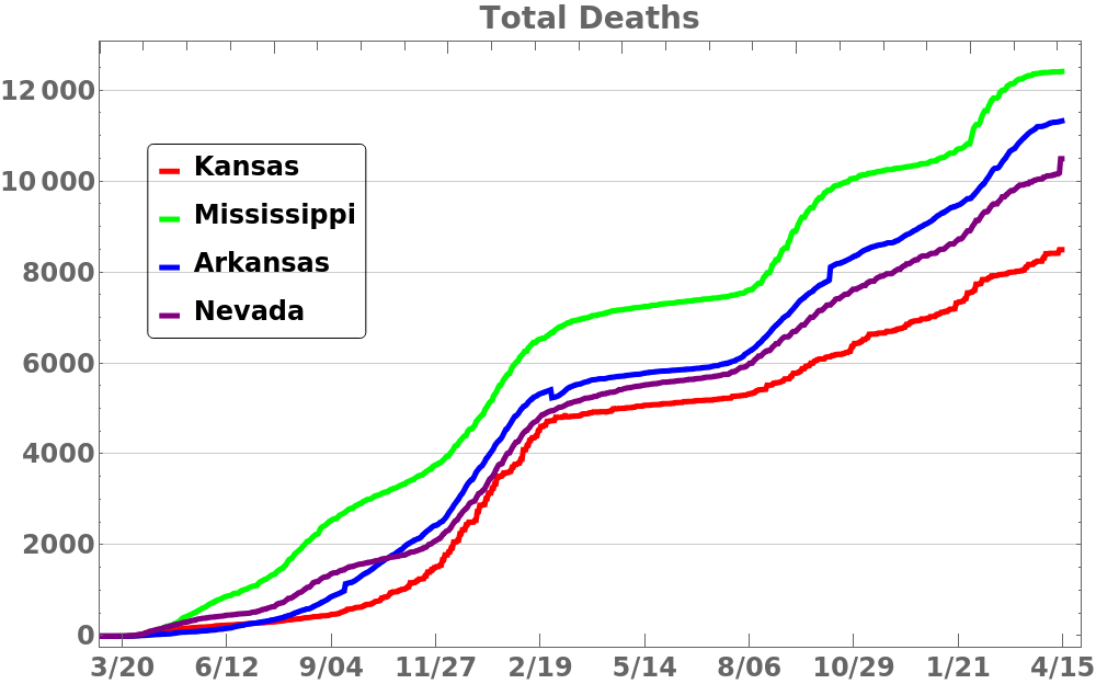
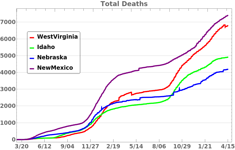
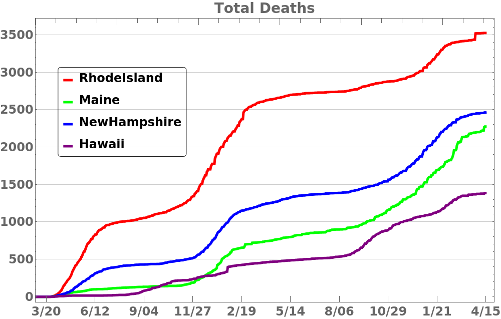
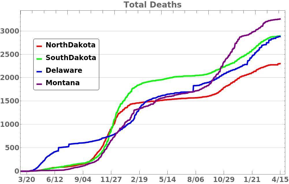
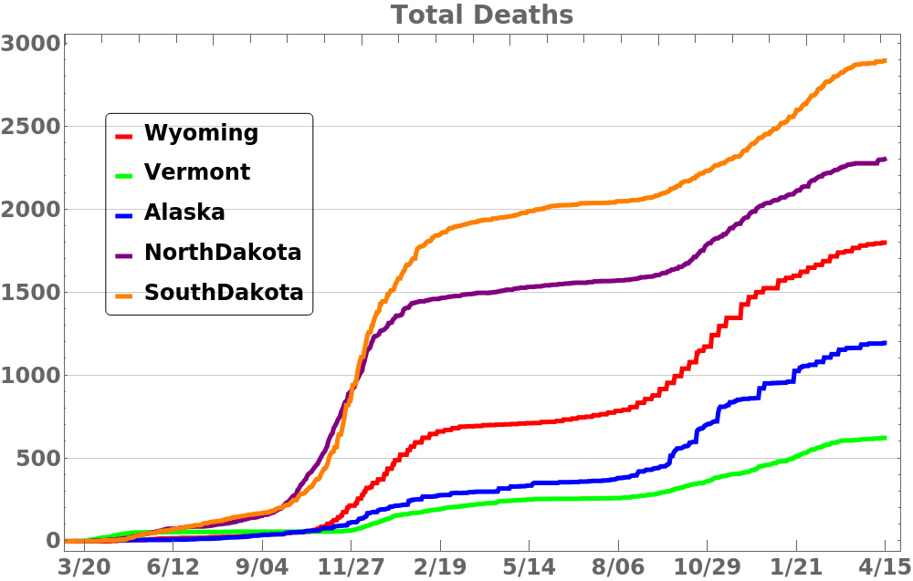
This first set of plots shows the running total of the number of deaths for the entire United States and then each state. The state plots show four states per graph, and the states are grouped according to their population. The scale is not the same on each plot, but grouping by populations offsets the disparity in absolute numbers. One can see the number of deaths per day was slowing but is now rising again.
Total deaths in US averaged over one week. Lines indicate doublings.
States sorted by population
Click to enlarge.


The following plots show the same information but using a logarithmic scale which better shows exponential growth. The slope of the curve is the factor 


States sorted by population
Click to enlarge.