Unstable Focus

Spiraling away from equilibrium

  • About
  • Visualizing Data ▼
    • Monty Hall Problem Simulator
    • Visualizing Populations and Migration ▶︎
      • Migration To and From Each County by State
      • Migration Between States
      • State Population Changes
    • Elections and Politics (coming soon) ▶︎
    • Other Visualizations (more coming soon) ▶︎
      • Misc Visualizations
      • Employment/Salary Visualizations
      • Human Chirality
    • Visualizing COVID-19 (being updated) ▶︎
      • Commentary
      • Data and Visualization Posts
      • COVID-19 Deaths by State
      • Estimating COVID-19 Mortality Rate
      • Running Totals ▶︎
        • Total Infections
        • Total Deaths
        • Overall Mortality
        • Comparisons
      • Daily Changes ▶︎
        • New Infections
        • New Deaths
        • Incremental Mortality
        • Infections/Deaths per Test
      • Day-to-day Ratios ▶︎
        • Infections
        • Deaths
      • 3D Animations ▶︎
        • Infections
        • Deaths
        • Daily Infections
        • Daily Deaths
        • Mortality Rate
        • Comparisons
      • 2D Animations ▶︎
        • Infections
        • 1 in 100 Infected
        • Deaths
        • 1 in 1000 Dead
        • Daily Infections
        • Daily Deaths
        • Mortality Rate
  • Politics
  • Work
  • Life
  • Rant
  • Penn State
  • My Story

Other Visualizations

  • State taxes, 1996-2020
  • Employment/Salary Data
  • Happy Pi Day, 2022
  • Life expectancy change by state, 1990-2014

To be sorted:


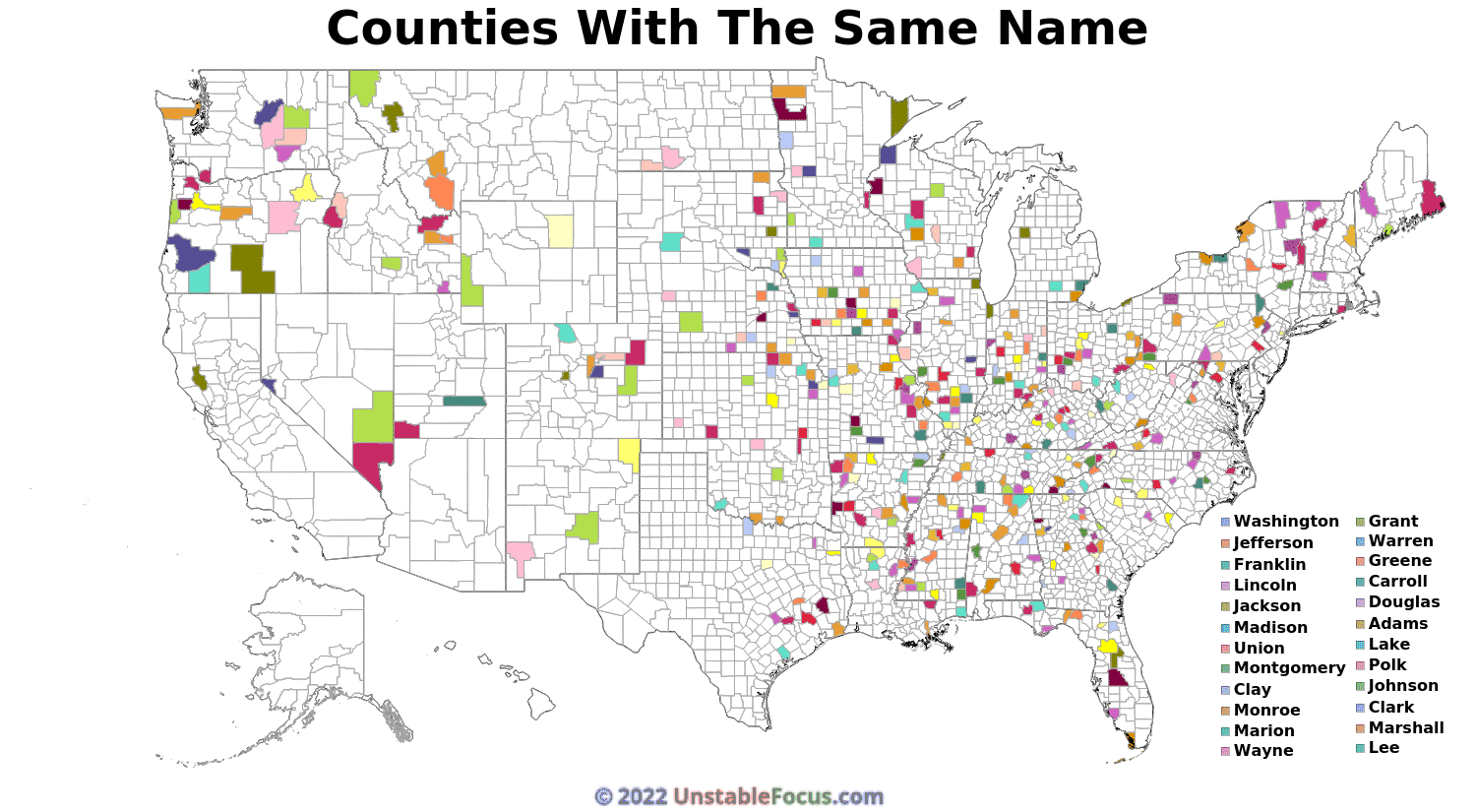
U.S. counties with the same name.


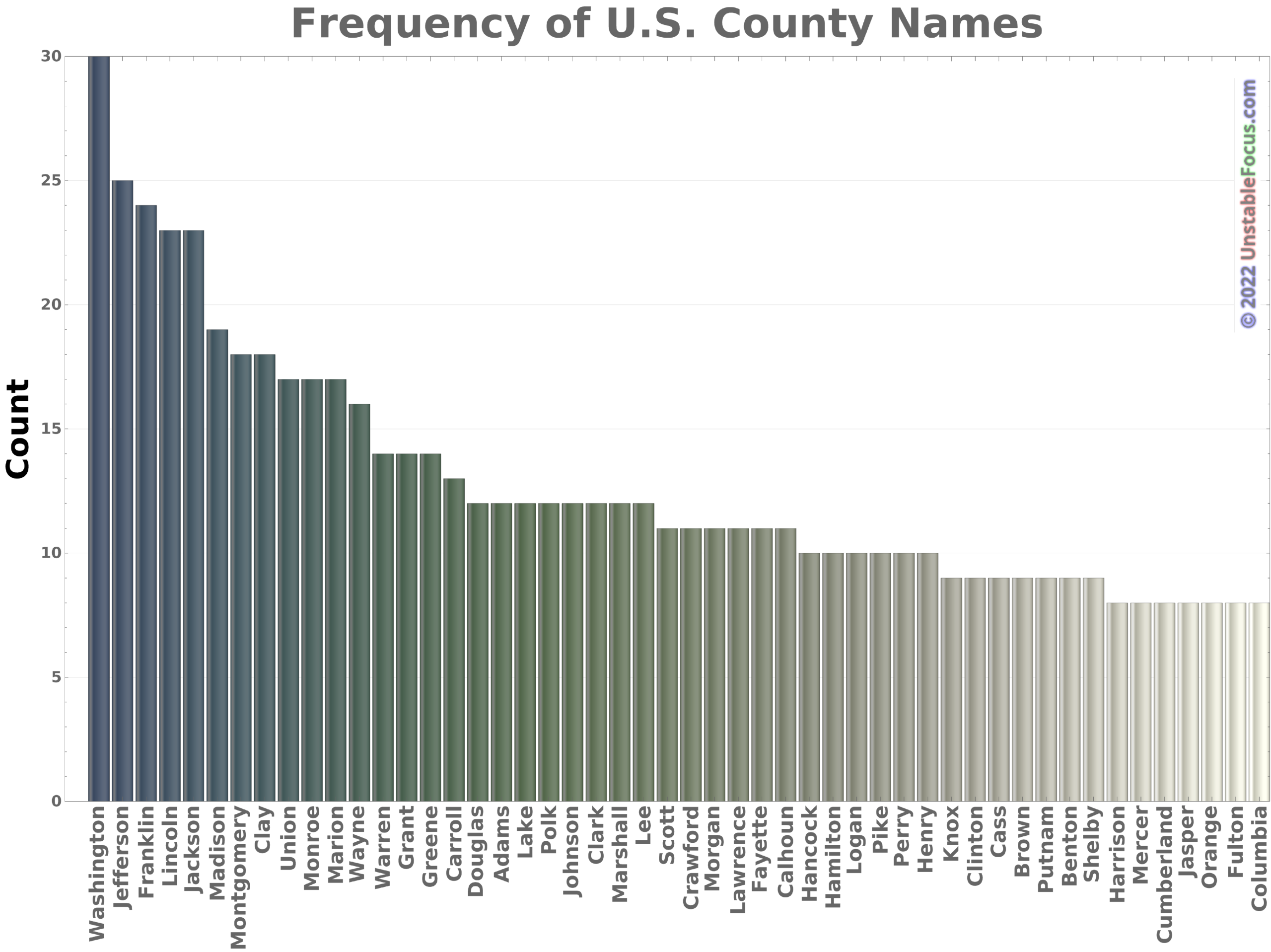
The animation below shows where counties with the same name are located.


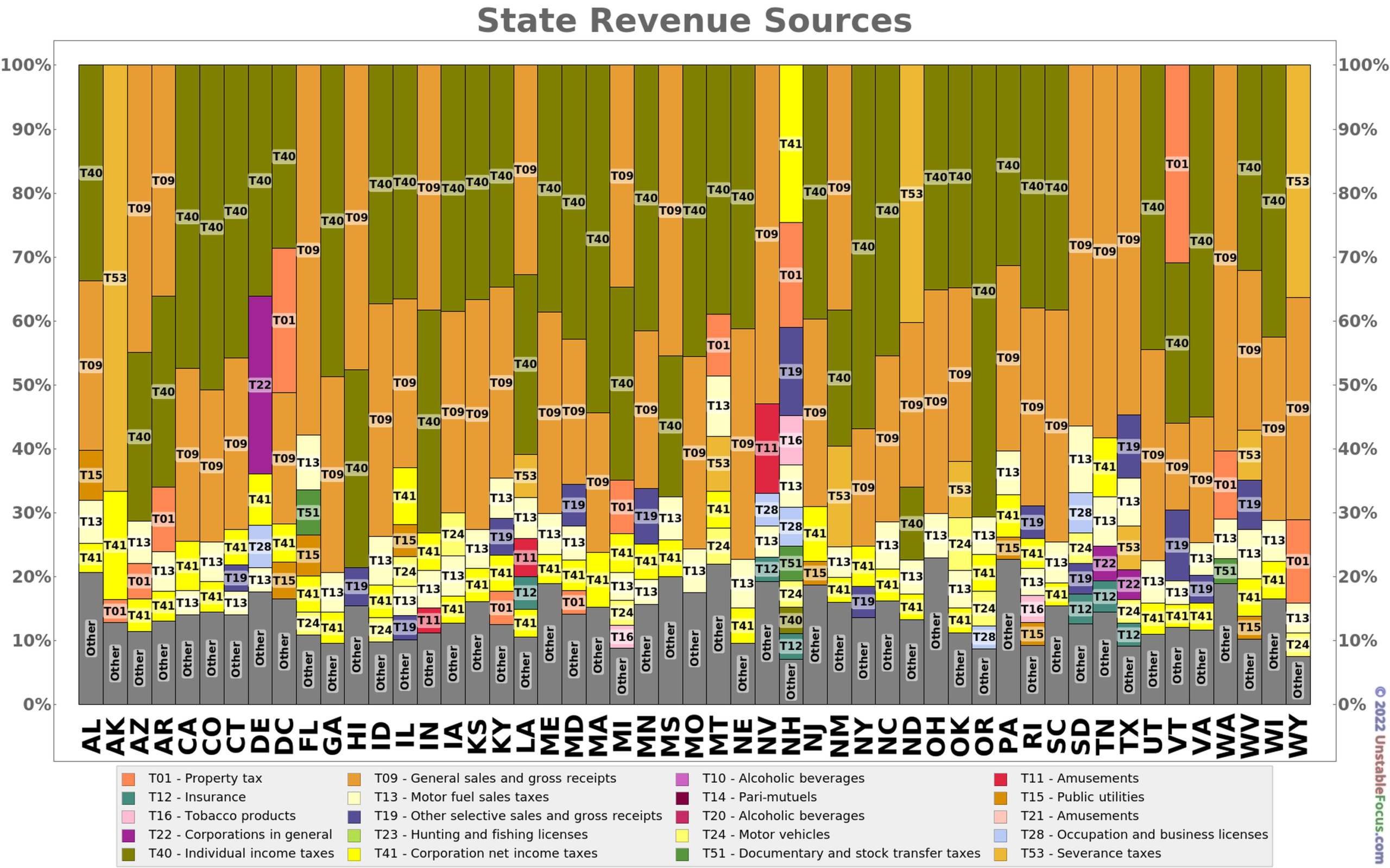
This shows where each state gets its revenue.  This is just money going directly to the state so property taxes (which in most states go primarily to local governments) do not appear for most states or are a small fraction.  Most states get their revenue from sales and income taxes.  Severance taxes are those imposed on resources (oil, etc.) taken from state lands.


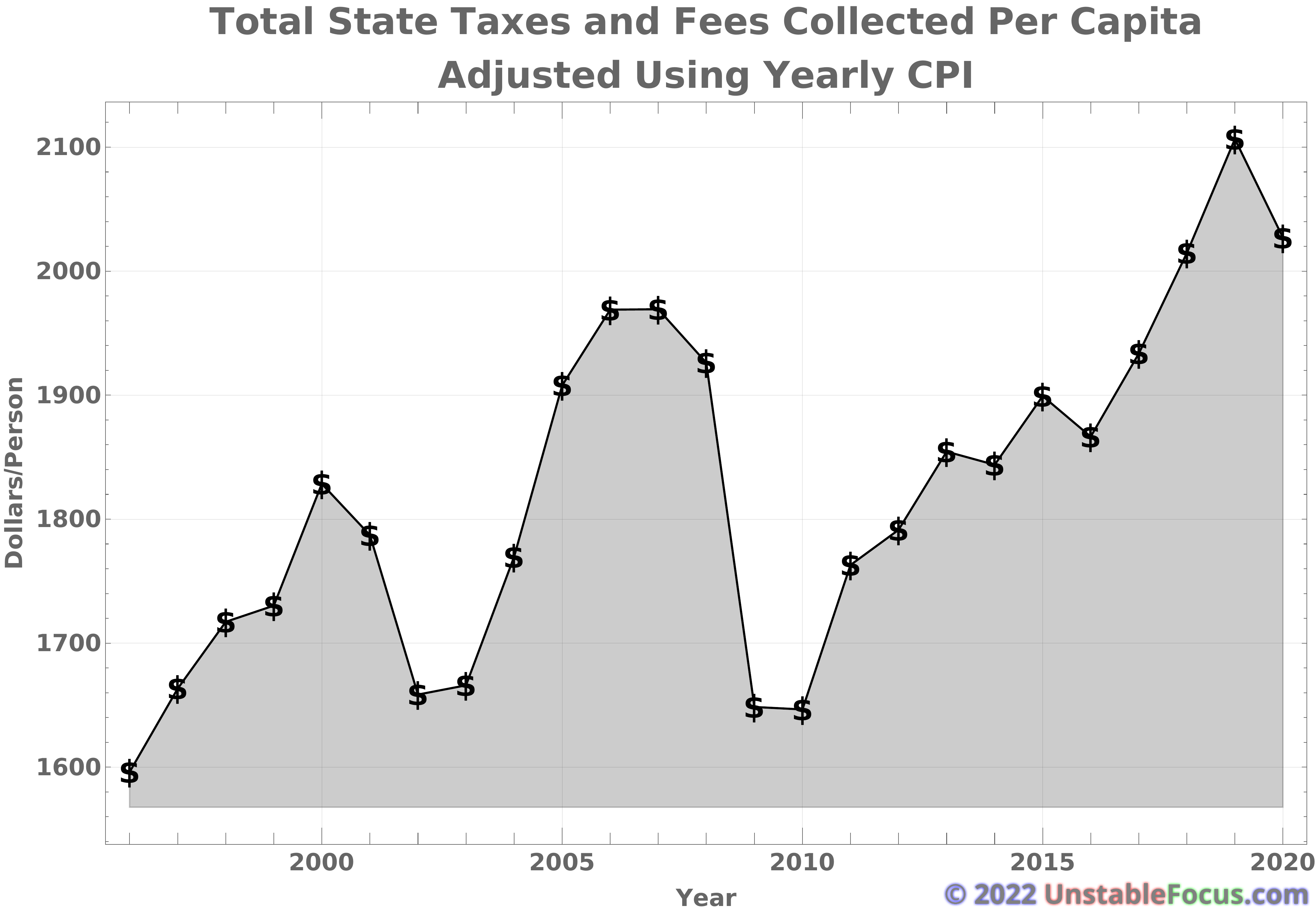
This shows how total state taxes and fees have changed since 1996 if inflation using the CPI is taken into account.  Thus, the dollars on the vertical axis are 1996 dollars.


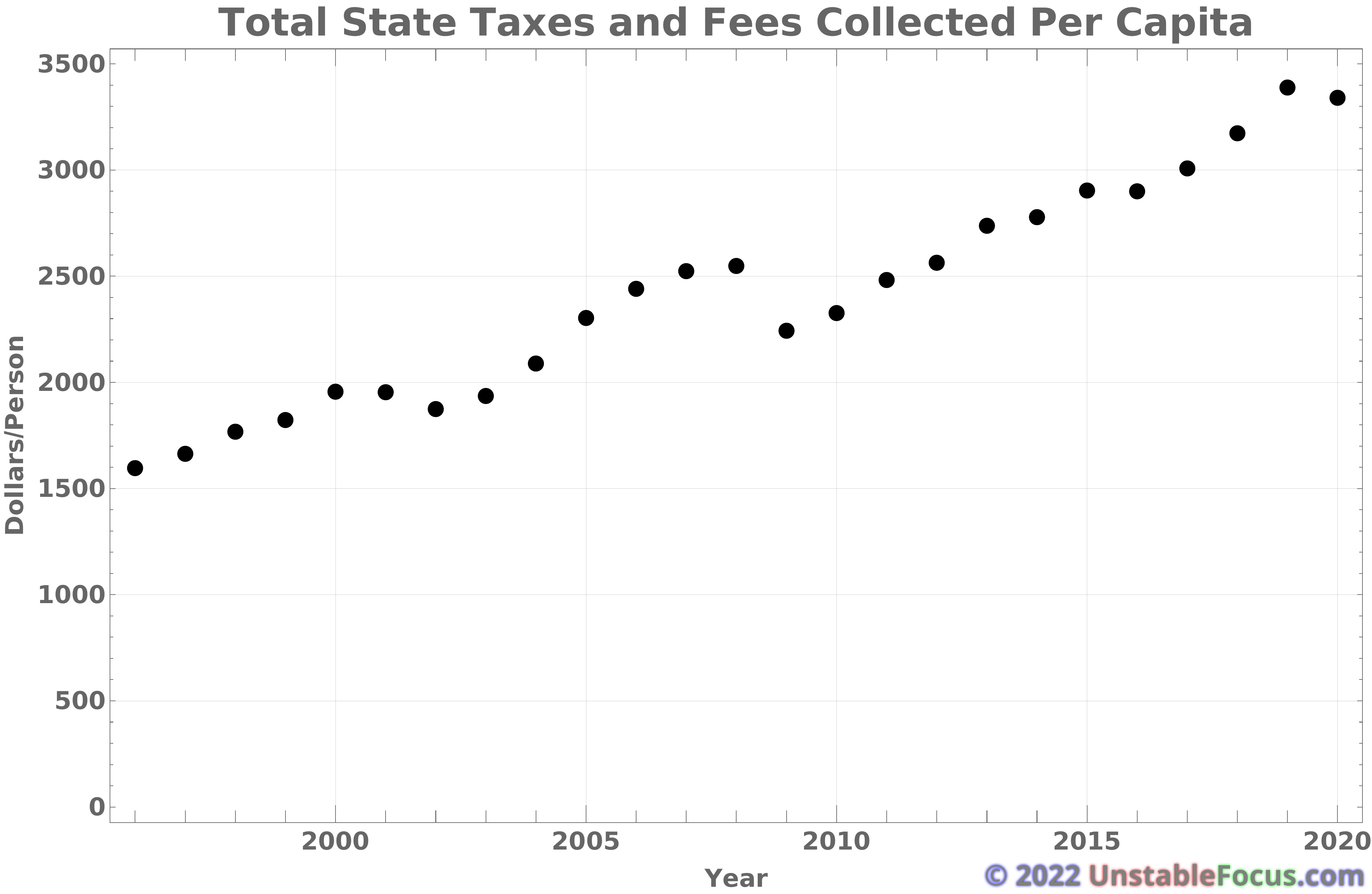
This shows how total state taxes and fees have changed since 1996 if inflation is not taken into account.  Thus, the dollars on the vertical axis are “real” dollars.


The linked animation below shows the crude oil imports to and exports from the United States since 1991.

http://unstablefocus.com/wordpress/wp-content/uploads/CrudeImportExport.mp4

The linked animation below shows the total petroleum imports to and exports from the United States since 1991.

http://unstablefocus.com/wordpress/wp-content/uploads/PetroleumImportExport.mp4

The linked animation below shows the gasoline imports to and exports from the United States since 1991.

http://unstablefocus.com/wordpress/wp-content/uploads/GasImportExport.mp4

The animation below shows the trade (imports and exports) volume in U.S. dollars between major trading nations from 1981 to 2020.  The color scale is logarithmic since there are vast differences in trade.


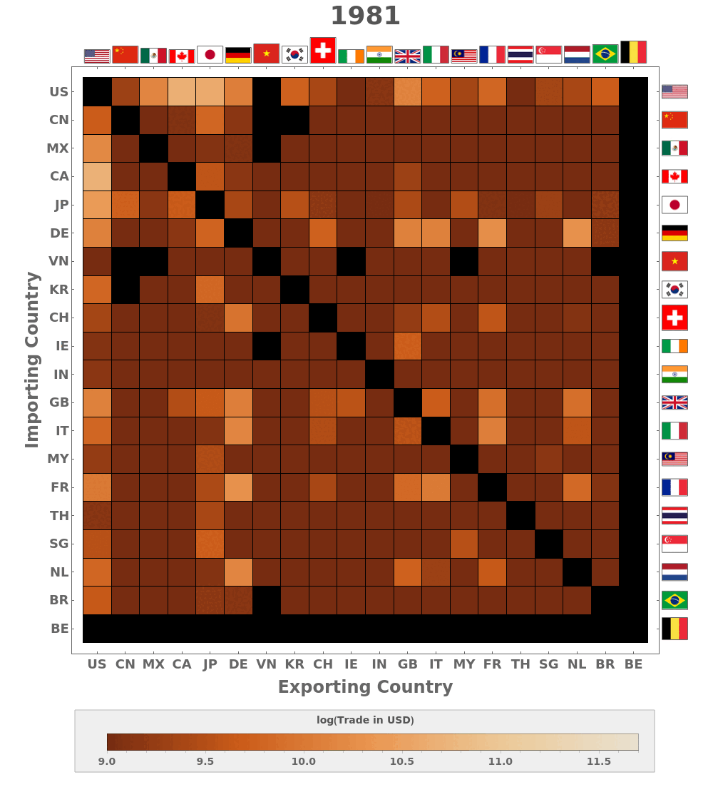
The image below shows the number of people with a Wikipedia page with a given birth year since 1 CE (AD).  The vertical scale is logarithmic since the number of pages is growing logarithmically.  It’s not clear what was going on in the 1600s when the number of notable people (at least since the start of Wikipedia) stagnates.  Before 1700, many birth years are rounded leading to notably more scatter.  This was produced in early January 2022 when eight newborns already had pages.


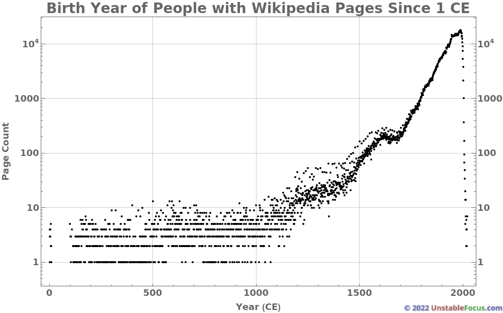
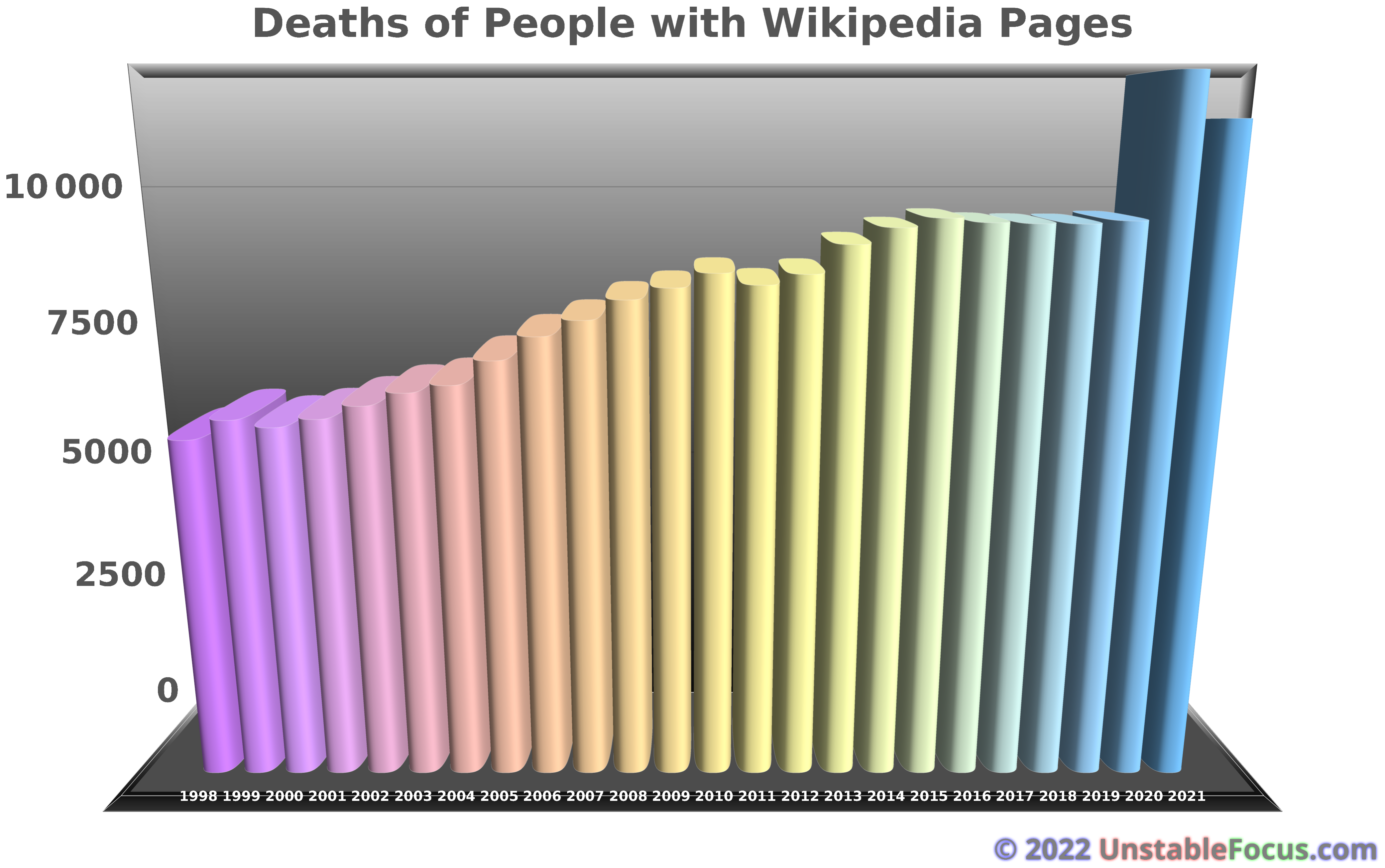
The utterly gratuitous bar graph below shows the number of notable people (i.e. ones with Wikipedia pages) that died from 1998 through 2021.  I made this to try to convince some of my crazy friends that COVID-19 was actually real, and a lot of extra people were dying.  I don’t think it made any impact.  Lol.


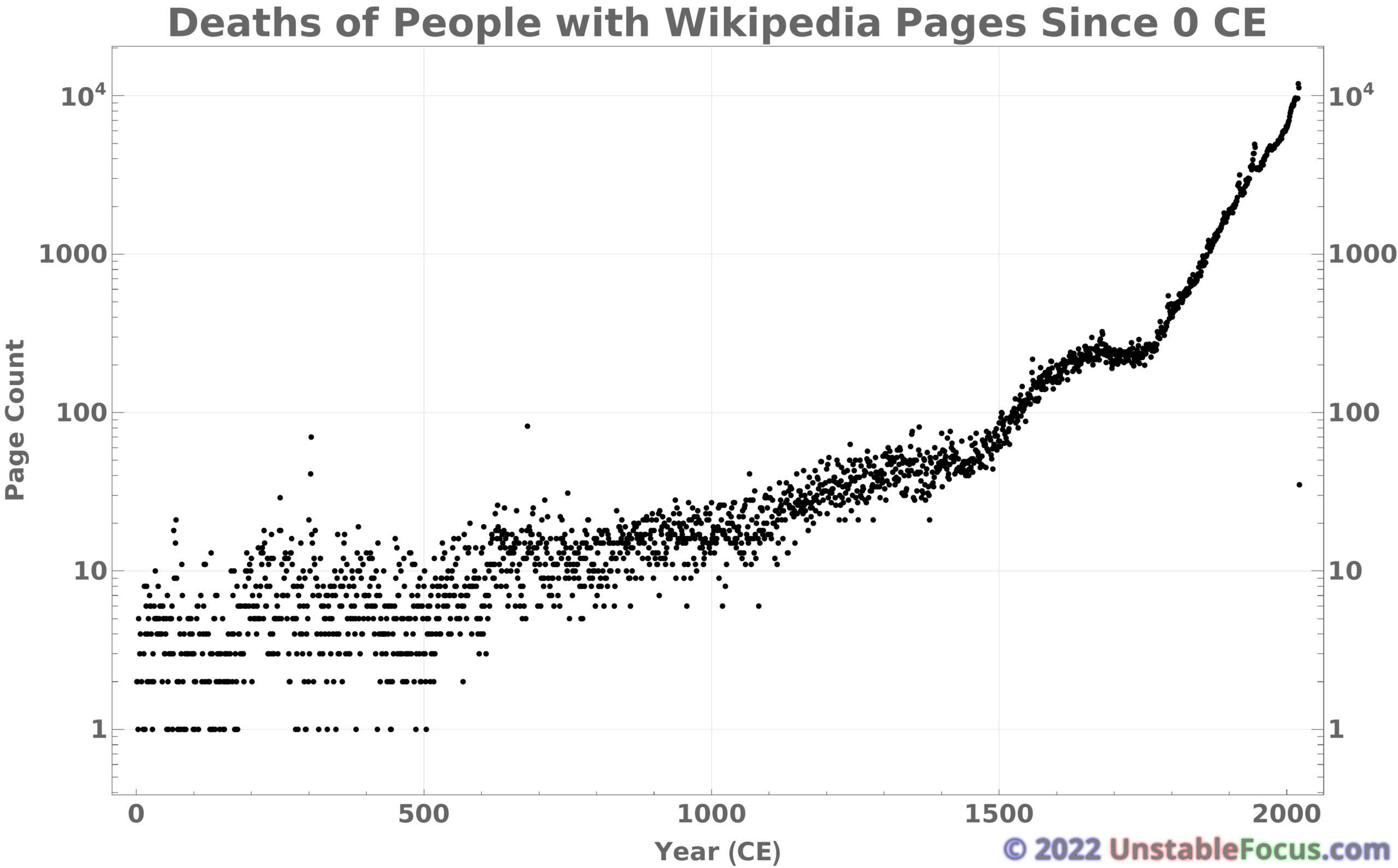
The chart below expands the one above to include all years since 0 CE (well, actually, 1 CE).  As with the births of people with Wikipedia pages, there is a strange stagnation between around 1650 and 1750.  It is not clear what accounts for this.  You can also see spikes around the first and second world wars.  The increase in 2020 and 2021 is also clear.  When this was made around the second week of January 2022, about 35 notable people had died.


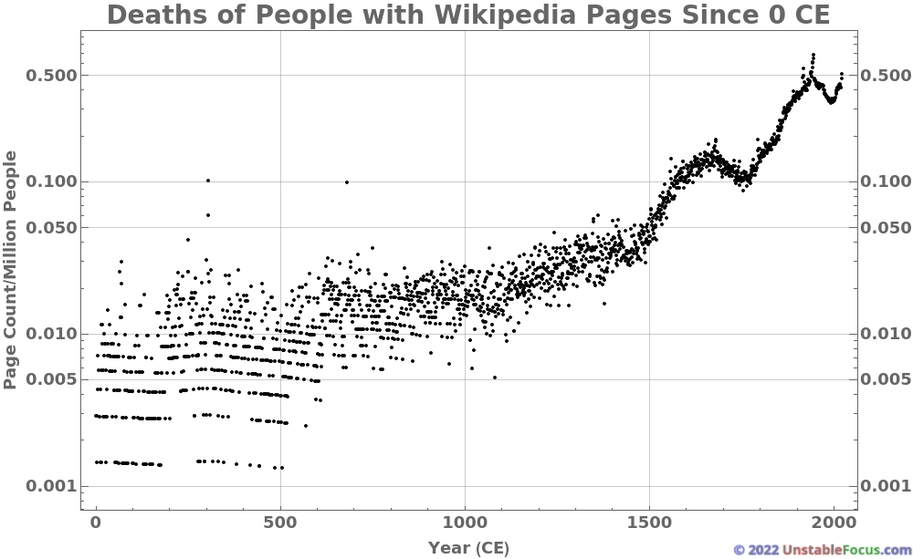
The graph below shows the same information as the one above but is now normalized with an estimate of the world’s population.  The peak in deaths of notable people during WWI and WWII are now even more prominent.  In 2020 and 2021, about one in two million people had their death recorded on a Wikipedia page.

  • February 2023
    M T W T F S S
     12345
    6789101112
    13141516171819
    20212223242526
    2728  
    « May    
  • Recent Posts

    • Martian Immigration
    • Excess Deaths, Comorbidities and COVID-19
    • Violence during protests
    • Trump vs. Twitter V
    • Executive Orders I
  • Archives

    • May 2022
    • August 2020
    • May 2020
    • March 2020
    • September 2016
    • July 2015
    • May 2015
    • July 2014
    • February 2013
    • August 2012
    • July 2012
    • May 2012
    • April 2012
  • Pages

    • 1 in 100 Infected
    • 1 in 1000 Dead
    • About
    • Animations 2D
    • Animations 3D
    • Comparison to Leading Causes of Death
    • Comparison to Other Causes
    • COVID-19 Deaths
    • COVID-19 Deaths in Alabama
    • COVID-19 Deaths in Alaska
    • COVID-19 Deaths in Arizona
    • COVID-19 Deaths in Arkansas
    • COVID-19 Deaths in California
    • COVID-19 Deaths in Colorado
    • COVID-19 Deaths in Connecticut
    • COVID-19 Deaths in Delaware
    • COVID-19 Deaths in District Of Columbia
    • COVID-19 Deaths in Florida
    • COVID-19 Deaths in Georgia
    • COVID-19 Deaths in Hawaii
    • COVID-19 Deaths in Idaho
    • COVID-19 Deaths in Illinois
    • COVID-19 Deaths in Indiana
    • COVID-19 Deaths in Iowa
    • COVID-19 Deaths in Kansas
    • COVID-19 Deaths in Kentucky
    • COVID-19 Deaths in Louisiana
    • COVID-19 Deaths in Maine
    • COVID-19 Deaths in Maryland
    • COVID-19 Deaths in Massachusetts
    • COVID-19 Deaths in Michigan
    • COVID-19 Deaths in Minnesota
    • COVID-19 Deaths in Mississippi
    • COVID-19 Deaths in Missouri
    • COVID-19 Deaths in Montana
    • COVID-19 Deaths in Nebraska
    • COVID-19 Deaths in Nevada
    • COVID-19 Deaths in New Hampshire
    • COVID-19 Deaths in New Jersey
    • COVID-19 Deaths in New Mexico
    • COVID-19 Deaths in New York
    • COVID-19 Deaths in North Carolina
    • COVID-19 Deaths in North Dakota
    • COVID-19 Deaths in Ohio
    • COVID-19 Deaths in Oklahoma
    • COVID-19 Deaths in Oregon
    • COVID-19 Deaths in Pennsylvania
    • COVID-19 Deaths in Rhode Island
    • COVID-19 Deaths in South Carolina
    • COVID-19 Deaths in South Dakota
    • COVID-19 Deaths in Tennessee
    • COVID-19 Deaths in Texas
    • COVID-19 Deaths in Utah
    • COVID-19 Deaths in Vermont
    • COVID-19 Deaths in Virginia
    • COVID-19 Deaths in Washington
    • COVID-19 Deaths in West Virginia
    • COVID-19 Deaths in Wisconsin
    • COVID-19 Deaths in Wyoming
    • COVID-19 Mortality Rate
    • COVID-19 Mortality Rate 2D
    • Daily Changes
    • Daily Deaths Attributed to COVID-19
    • Daily Deaths Attributed to COVID-19 2D
    • Daily Infections Attributed to COVID-19
    • Daily Infections Attributed to COVID-19
    • Day-to-day Ratio of Deaths
    • Day-to-day Ratio of Infections
    • Day-to-day Ratios
    • Deaths Attributed to COVID-19
    • Deaths Attributed to COVID-19 2D
    • Elections and Politics
    • Employment Visualizations
    • Estimating COVID-19 Mortality Rate
    • glossary
    • Human Chirality
    • Incremental Mortality
    • Infections Attributed to COVID-19
    • Infections Attributed to COVID-19 2D
    • Martian Immigration
    • Migration Between States
    • Migration To and From Each County by State
    • Migration: United States
    • Misc Visualizations
    • Monty Hall Problem Simulator
    • My Story
    • New Deaths
    • New Infections
    • Other Visualizations
    • Overall Mortality
    • Overview
    • Running Totals
    • State Population Changes
    • Test Page
    • Testing
    • Total Deaths
    • Total Infections
    • Visualizing COVID-19
    • Visualizing Data
    • Visualizing Populations and Migration
Proudly powered by WordPress Theme: Parament by Automattic.
 

Loading Comments...
 

You must be logged in to post a comment.