Data and Visualization

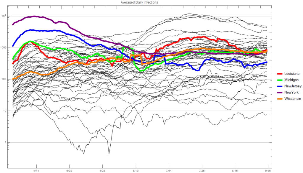
I have updated the plots with the data up to May 24, 2020, and highlighted Wisconsin since people seem to be interested in what’s happening there.

While I haven’t lived in Michigan in 27 years, I still have many friends and family members that live there, and I go there fairly regularly.  It seems many people are upset with how their governor has handled the shutdown and enforced social distancing, although it appears from polls that the majority of people support her policies.

Besides simply being upset that small business owners are being hurt by this, it seems that many people are upset that they were/are not allowed to go to vacation properties that are usually located in rural areas of northern Michigan.  I suspect the thought here was that this was part of an overall limiting of travel.  I can understand this from a health perspective as it would keep the spread in areas where there are far more healthcare resources.  I can also understand that at a time when people are social distancing, they would like to be able to get away for a bit, and in many ways increase social distancing.

I have also heard many complaints about not being able to go out in boats, and I have to say I really do not understand the reasoning for this.  Maybe it’s to limit the number of people that need to monitor boating and/or needing to respond to emergencies.  While boating isn’t a huge thing in Pennsylvania, I don’t think there are any limitations here, and I’ve not heard of this in other states; but I may be wrong.

Finally, it seems people are particularly concerned with barbershops and salons.  I’m not sure what the particular concern is with these places other than that many are indeed small businesses.  However, there are all kinds of other small businesses that are also being hurt.  I can understand the government’s stance to keep them closed to enforce social distancing which is hard to do when you’re getting your hair cut.  If we’d have built up our testing capabilities faster, then maybe barbers and beauticians could be regularly tested and given some certificate to ensure customers of this.  It also seems like barbers and beauticians have made very public statements about their feelings.  However, it seems to me that there are just as many small gym owners and personal trainers as there are barbers and beauticians.  I don’t hear about them complaining, although I’m sure they are, at least privately.

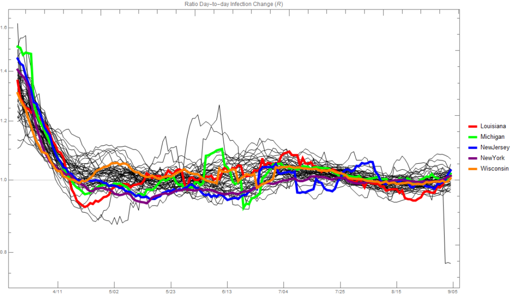
So, let’s take a look at the data (with all the caveats attached) for Michigan.  First, let’s look at the ratio of day-to-day changes in the number of infected; this is often called R.  The plot below shows this for all states with four highlighted for comparison.  The points above 1.45 at the start that aren’t highlighted are from Missouri.  It’s clear that things started off in Michigan with the virus spreading very fast, and there’s plenty of speculation on why that was.
If we look at the new infections each day averaged over a week, we see that, as suggested by the plot above, the infections spread in Michigan very fast.  Sometime in the first half of April things changed dramatically, as they did in Louisiana.  New infections have now steadied for both states.  Note that Michigan’s population is about twice that of Louisiana’s and slightly more than New Jersey’s.  Although the infection rate seems to be increasing slightly in the last couple weeks, I suspect the attitude is from a healthcare perspective, “Whatever we’re doing is working, so let’s keep doing it.”  From an economic perspective it’s really hard to say, but it’s certainly realistic to think that there could be another explosion in the number of cases.  If there is one I suspect it’d be less severe than the first time because people are simply more away and taking precautions.  Illinois now has the most new infections of any state, and California is catching up to New York.
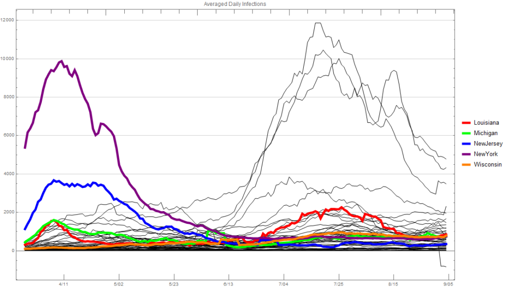
Linear scale
Logarithmic scale

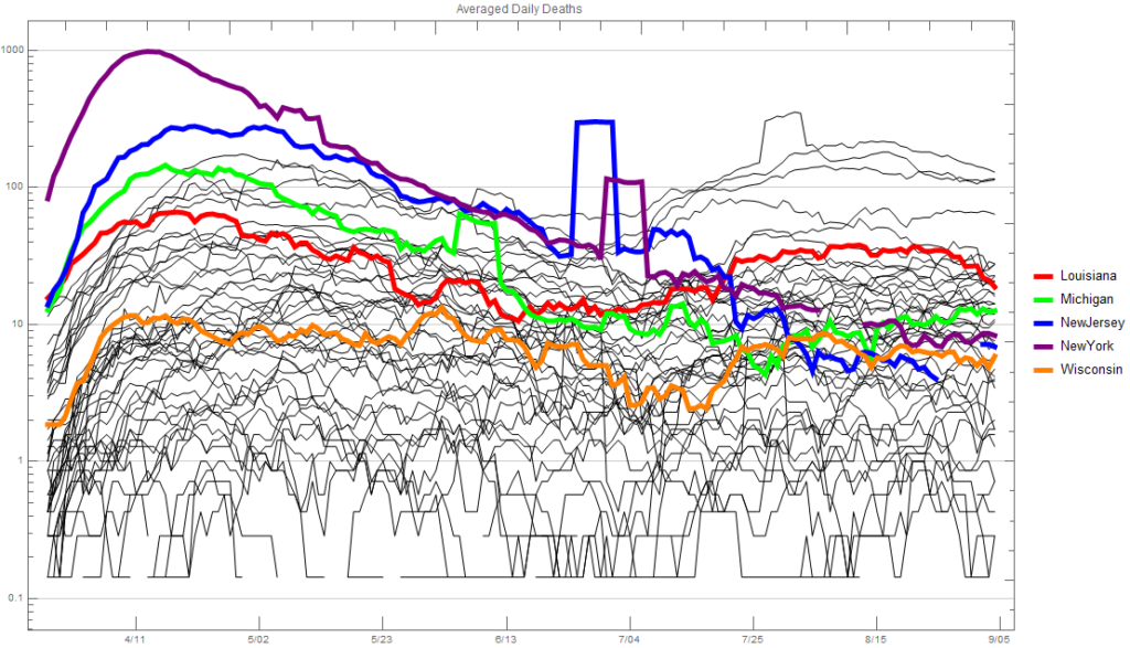
Now let’s take a look at deaths each day, again average over a seven day period.  I think this is the one that got the Michigan government/governor very concerned.  While the number of daily new infections mirrored that of Louisiana closely, the number of deaths each day was more than double for many days.  It’s hard to determine why this was besides maybe an older and less healthy population.  Louisiana’s infections were concentrated around New Orleans like Michigan’s were concentrated around Detroit.  I doubt the medical care in the Detroit area is any better or worse than in the New Orleans area.  Likewise I would think that per capita the capacity would likely be the same.
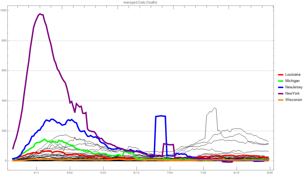
Linear scale
Logarithmic scale

I have no idea if the actions Michigan’s governor took and is taking are the best strategy overall.  It certainly seems to be from a healthcare perspective.  The big questions that will never be answered are:  How many people would have died or gotten severely ill without the actions taken?  And, how much better would the economy be without those actions?  My personal feeling is that a couple thousand more people would have died and the economy would probably not be a whole lot better.  New data from Politico says that “…that Georgia now leads the country in terms of the proportion of its workforce applying for unemployment assistance. A staggering 40.3 percent of the state’s workers — two out of every five — has filed for unemployment insurance payments since the coronavirus pandemic led to widespread shutdowns in mid-March, a POLITICO review of Labor Department data shows.”

I’m not really sure of a good way to look at the life versus economy tradeoff.  Maybe the best way is to think that we (you) saved 2,000 lives but lost 2,000 small businesses.  That’s still a hard one to judge, but I would think many small business owners would trade their business for the life of a loved one.

There has been quite a bit of debate about the “dire” predictions that COVID-19 models have made and are making for infections and, especially, deaths, and how those predictions are being used to scare people.  I can say with a great deal of certainty that scientists making these models and doing the simulations are not intentionally trying to scare anyone.  (The only “scientists” I am skeptical of are the ones trying to sell books or market themselves for something.  The “Plandemic” woman is in this category.  She’s been peddling false hope to people with chronic illnesses for a long time.)  On the other hand, in the hands of the media and politicians the predictions can be used in many different ways.  I think many of the early models used a few different scenarios:  we do nothing, we socially distance and/or shutdown, we discover a vaccine, etc.  If you want to scare people, the predictions from the models in which we do nothing can certainly be used, and I believe that if we had done nothing we would be in a very serious situation.

I’ve spent most of the last 30 years developing and analyzing models, mostly trying to predict how physical systems will respond.  Physical system models are not hard to develop if you understand the physical laws that govern them (and the mathematics needed to study them).  There have been very few advances in modeling physical systems at scales visible to humans in nearly a century.  That is why physicists rightly say that most of what engineers do is classical physics.  One nice thing about physical systems is they are not alive to change their behaviors to something not included in the model.  (Note, “smart” materials on which I did a lot of research are not actually smart. [1])  Another nice thing is you can do controlled experiments to validate your model.  Finally, you have a lifetime of experience and intuition to use to see if the results make physical sense.  However, I think the best results are the ones that do not initially make intuitive sense and require you to adjust your intuition.  See footnote [2] for a great example of this and footnote [3] for my experience trying to get engineering students to use their intuition and common sense.

The basic model for disease spread is what’s called the SIR (susceptible/infected/recovered) model; there are many variations and extensions of this.  There are also many good explanations of this model online so I won’t go into details about it here.  I would recommend watching the YouTube video I’ve embedded at the end.  One thing to know about these models is that they are statistical and have many parameters that people can “tweak” and many “features” that can be added.  Being statistical, they will only give you an “average” sense of what might happen.  Likewise, you can adjust the parameters to get almost any prediction.  This is where so-called fitting comes in.  Scientists will tweak the parameters until they fit known cases and hope those parameters will predict what will happen in the future.  When scientists share these models they usually provide the parameters they’ve used and what “ingredients” have been included.  Although some people want to keep their models proprietary, and I would be skeptical of them.  The problem here is that by the time the predictions hit the media and politicians all those details have been stripped away to make it more digestible for the general public.

Statistical models have been used in physics for over a century, and from basically the time we realized matter was made of atoms but we could still measure properties of matter without having to keep track of every atom.  For example, the temperature of something basically measures on average the energy contained in the atoms/molecules comprising the material.  We don’t need to track every atom to get this average.  Likewise, the pressure from the air you feel is the forces of all the molecules in the air hitting you.  If the wind hits you from one side you notice a net force acting to push you in the direction the wind is blowing.  This is simply because more molecules are hitting you on one side than the other creating a net force that wants to move you.  Again, we do not need to keep track of every molecule/atom to determine what this force is.

Statistical models in physics (a subject called statistical mechanics) work extremely well and are used extensively.  Like SIR models statistical mechanics models can be more or less complicated by adding or removing ingredients.  For example, the “ideal gas law” that relates pressure, temperature, and volume was known long before we understood anything about atoms, and we now know that it can be completely derived by averaging the motion of atoms and molecules modeled as balls bouncing around.  However, there are cases when the ideal gas law doesn’t work well.  For example if the gas is made from molecules you can include the rotation of the molecule as an ingredient.  It turns out that under “normal” conditions this ingredient isn’t needed, but under extreme conditions it helps explain why the ideal gas law fails.  The other time statistical models don’t work well is when you don’t have enough particles (i.e. atoms or molecules) to average over.  If you only have, say, one thousand atoms bouncing around in a box, statistical averaging starts to not work so well.  Fortunately, with modern computing power, we can model billions of atoms moving around using molecular dynamic simulations.

One reason statistical models and molecular dynamic simulation work so well is that atoms do not have free will, i.e. under the same situation they will all act the same.  People on the other hand are very different.  It’s this behavior and the feedback causing that behavior that makes modeling populations so hard.  If you have millions of people you can try to estimate how the average person will behave and include that in a statistical model.  Most of the variations of the SIR are doing just that, but modeling behavior even on average is very difficult.  While we could theoretically model every person in the United States acting in an average way, we know this would provide the same results as the statistical model.  We could include some randomness in the every-person model, but again with enough people you’re still going to get the average result.  What an every-person model may help predict is how a very non-uniform population density plays a role.  However, SIR models can be adjusted for this too.

To help explain the SIR model, the creator of the two videos below basically does molecular dynamics simulations with people replacing the atoms and behaving in different random ways.  Note the Twitter screenshot he includes around the 2:14 mark with someone responding to him, “Im not a gas in a box :'(”  Because he is only using around one thousand people walking basically randomly he makes many runs and averages the results.  To try to model the variation in people’s behavior he uses various percentages and looks at how these percentages change the results.  For example, he varies the percentage of people infected that get quarantined or the percentage of people traveling from one community to another.

When you’re modeling things with algorithms instead of equations you can play around with all kinds of probable behaviors and actions.  Things can get extremely complicated and often you have no idea what the result might be.  There is actually a scientific/mathematical buzzword for this called “emergent behavior.”  According to Wikipedia, “emergence occurs when an entity is observed to have properties its parts do not have on their own.”  You can think of your body as the emergence of all the individual cells doing their own thing.  Scientists and mathematicians are enamored with emergent behavior because you often see very interesting and realistic behaviors emerge from very simple models of how the parts interact.

While I am certainly biased, I believe the scientific community is doing a great job simply trying to keep people informed.  Unfortunately, their messages can get distorted and used politically.  Plus, scientists usually avoid words like “never” and “always” so when someone asks them if it’s possible 10 million people will die, they’ll simply answer, “Yes.  It’s possible.”


Footnotes

[1]  Playing with a dielectric elastomer “smart” material water balloon in the lab of my former student Nakhiah Goulbourne at the University of Michigan during the summer of 2010.  What makes this material “smart” is a crazy-stupid 5,000V being applied across the membrane, although there is very little current so not much power.


Wrinkled mylar balloon.

[2] A great example of needing to adjust your intuition based on strange results from a model is a model/simulation I worked on with Elaine Serina when we were graduate students.  Elaine wanted to understand how forces on your fingertip get transferred to tension in the skin and stresses on the bone as part of a larger study on carpal tunnel syndrome.  As a simple first step, we decided to model the fingertip as an ellipsoid (think of a plain M&M) inflated by water and then compressed between two plates.  We wanted the initial inflation because there is usually tension in your skin (unless you’ve been soaking in water and are all “pruney”).  However, when Elaine took the equations I derived and wrote code to solve them she kept getting strange results that we were both convinced couldn’t be correct.  The simulations were showing that when you inflated the skin membrane you would get compressive stresses.  Our intuition said, “You can’t inflate something and get compression.”  We spent at least a month trying to figure out what was wrong with the model and/or the code to no avail.  After a meeting with our thesis adviser in which he concurred with our intuition that something must be wrong, we were walking back to our lab through the student union and noticed the inflated mylar balloons.  One of us (likely me because I was the one studying wrinkling caused by membrane compression) realized that all the mylar balloons were wrinkled around the edges, just where our model was predicting compressive stresses.  The only way you get wrinkles is when you have compressive stresses.  Thus, we realized our intuition was wrong!  As you inflate a mylar balloon the edges want to pull in towards the center.  This creates the compression.  If you have a rubber balloon of this shape, adding more pressure will eventually cause the wrinkles to disappear.  However, because mylar is so stiff you can’t pressurize it enough to remove the wrinkles without it rupturing.

[3] I was always a bit disheartened with how many mechanical engineering students did not seem to have this intuition when they got to the junior-level class I regularly taught.  To address this, part of every homework problem was a statement about why they felt their answer was correct or incorrect.  Early in the semester I would get answers like, “Because I followed all the steps and checked the math.”  I was constantly shocked at how many mechanical engineering students did not come into the class with the skill of looking at the result they got and evaluating if it made physical sense.  Every semester I talked a lot about “sanity checks.”  Plus, I wanted to know if they suspected their answer was not correct, as it’s much better in the real world to know a result is likely not correct than to think it is.

I’m seeing this chart getting spread around a lot on Facebook and want to discuss it and the accompanying text a bit.
 
Here is the text:
“This is the TRUTH! Everything else is a lie! No matter what anyone says…death rate was, and will always be less than 1% chance! So we shut down economy for a virus with a 99.9% recovery rate? And it’s a known fact that a large amount of these deaths weren’t even from covid19. In fact, I still stand firm on no one under age of 19 dying from it! And no, don’t tell me about the 4 kids under age 19 that they claimed have died from covid…if you actually read the articles, you’ll see they aren’t from covid19. Have a great day people, and wake up please!!”
 
And the chart (which someone saved if a lossy file format, ugh):
 
First, I see nothing wrong with the actual numbers here. Someone obviously dumped things into a spreadsheet and did a few calculations. What is VERY wrong are some of the column labels especially the last one. That is the odds of not having died from COVID-19, YET. The percentage from which it was determined is the percentage of people that have already died from COVID-19. If you’re reading this you are 100% not in that category. We will not know the odds of dying from COVID-19 for decades.
 
Second, this is NOT the death rate or the survival rate, at least not how one would typically define them. If it were the survival rate, then the chances of surviving, say, setting a grenade off in your mouth would be very very high.
 
The real death rate is a very tricky thing to calculate even for things like pneumonia because not everyone that has it reports to someone that they do. What we know very clearly is that if you wind up going to the hospital with pneumonia you have about a 95% chance of surviving it (or a 5% chance of dying from it). From what I can calculate based on hospitalizations, the death/mortality rate of COVID-19 is higher than that of pneumonia, roughly twice that. But that’s if you go to the hospital. Maybe this is a virus that is devastating to some people and so the percentage of people that have it going to the hospital is much less than the percentage of people going to the hospital with pneumonia. We just don’t know.
 
If we were to take the data provided here, and let’s use Michigan (for fun) as the example. First you need to assume what percentage of the population will eventually get the virus. This will depend a lot on when a vaccine is available. However, let’s say 10% in the next, say, two years. If that is the case then about 1 million people will get it. So we take that total cases number and make it 1 million. Now it looks like about 10% of those in Michigan reported to have it have died. I’m guessing that number is more like 2% including all unreported cases. So, let’s say 2% of those 1 million people die. That comes out to be 20,000 people, or about 0.2% of the total population. You can look at that percentage as good or bad. But it’s a lot when you compare it to other ways of dying.